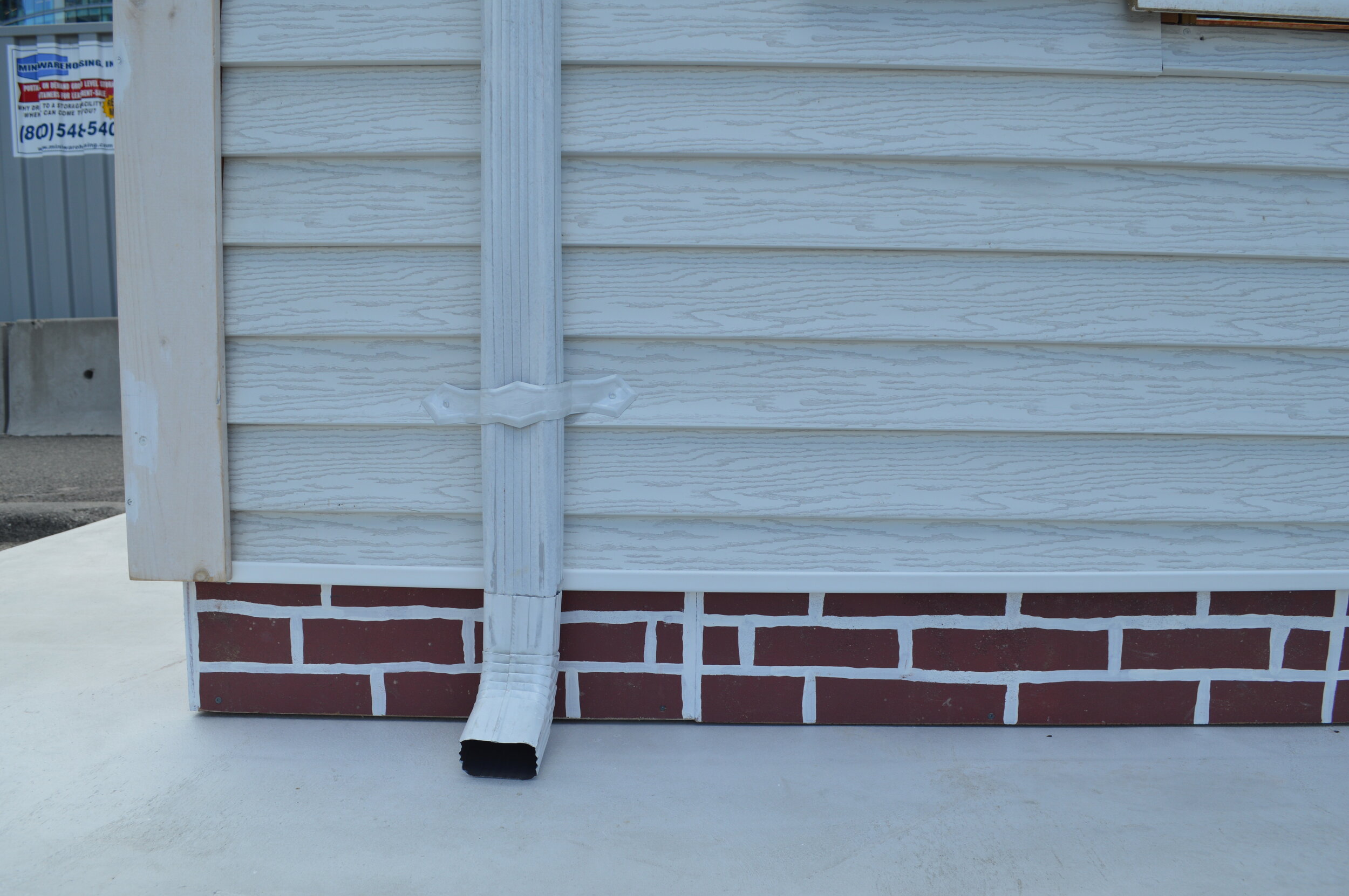
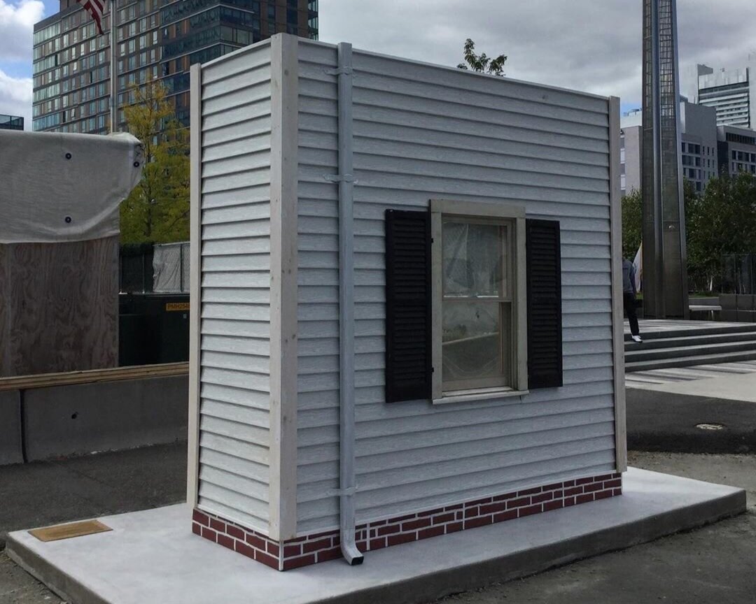
I was interested in building a full-scale mock-up after being inspired by the forms that are so frequent around the Seaport and South Boston, where I live. I found them aesthetically beautiful as objects on their own, and loaded with the implications of the developments that follow the forms. I was curious if there was a way to invert this form back on itself and continue a body of my work that investigates luxury development and housing policy in Boston. The accelerator, and MOCK, gave me a vehicle to bring the conversations of gentrification and displacement that are happening all over the city directly into the seaport.
The strategy for the design and construction of Mock was centered around mimicking the form of a real full-scale mock-up, building a partial wall of a three-decker, and figuring out how to do this in a parking spot on a busy street with a short timeline.
With the help of Brendan Shea, Anthony Sanchez, and Jamie Horgan — I was able to come up with a good plan to effectively transform my concept into a real structure.
For construction, the model was essentially split into 3 parts; the concrete base, the wood framing, and the interior.
On the first day, we assembled the base for the concrete in the parking spot, pouring it, leveling it and letting it dry for 48 hours.
As this dried we built the framing structure in pieces that could be transported and assembled on the base, with minimal tool use.
This went up quickly, and we were able to focus the final 2 days on hanging the wallpaper, art, and trim — and then coating the wallpaper in a waterproof varnish. I think the biggest challenge was in making sure we were prepared for everything on site. The limited timeframe and the peculiar nature of installing in a parking spot forced us to spend a lot of time preparing for everything we would need, and problem solving in advance for any potential problems. The only thing that was completely out of our control was the weather, and fortunately we got 4 nice days for installation.
The interior was made up of a hand-drawn wallpaper covering the walls in eviction red and “family photos” highlighting the city’s history of housing policy. The photos were pulled from the Boston Public Library, Leslie Jones Collection, the La Alianza Hispana Records, courtesy of Northeastern University Archives and Special Collections, the City of Boston Public Works Department Archive, and the Boston Pictorial Archive at the Boston Public Library.
After experiencing all of the time, energy, and work that went into the project, it was a funny feeling to have it look just like the simple line drawing from 6 months prior but ultimately that was the goal, and a satisfying feeling.


